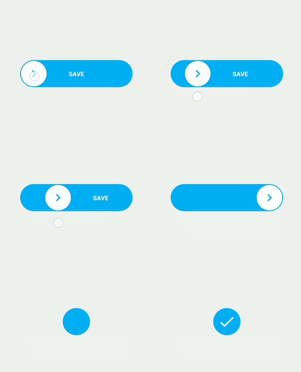
Creating a Swipe Component in Vue.js like Swiggy and Zomato Payment Gateway Button

If you’re looking to implement a swipe component in your Vue.js application, similar to the swipe functionality seen in payment gateway buttons on platforms like Swiggy or Zomato, you’re in the right place! In this blog post, we’ll walk you through the process of building this functionality using the popular Vue.js package, @vueuse/core.
Step 1: Install @vueuse/core Package
To begin, you’ll need to install the @vueuse/core package, which provides several useful utilities, including the one we need to create the swipe functionality.
Run the following command in your terminal:
npm i @vueuse/coreStep 2: Create the Swipe Component
Once the package is installed, it’s time to create the swipe component. Below is the complete code for the swipe component.
Component Code:
<script setup lang="ts">
import { computed, ref } from 'vue'
import { usePointerSwipe } from '@vueuse/core'
import type { UseSwipeDirection } from '@vueuse/core'

const target = ref<HTMLElement | null>(null)
const container = ref<HTMLElement | null>(null)

const containerWidth = computed(() => container.value?.offsetWidth)

const left = ref('0')
const opacity = ref(1)

function reset() {
  left.value = '0'
  opacity.value = 1
}

const { distanceX, isSwiping } = usePointerSwipe(target, {
  disableTextSelect: true,
  onSwipe(e: PointerEvent) {
    if (containerWidth.value) {
      if (distanceX.value < 0) {
        const distance = Math.abs(distanceX.value)
        left.value = `${distance}px`
        opacity.value = 1.25 - distance / containerWidth.value
      } else {
        left.value = '0'
        opacity.value = 1
      }
    }
  },
  onSwipeEnd(e: PointerEvent, direction: UseSwipeDirection) {
    if (distanceX.value < 0 && containerWidth.value && (Math.abs(distanceX.value) / containerWidth.value) >= 0.5) {
      left.value = '100%'
      opacity.value = 0
    } else {
      left.value = '0'
      opacity.value = 1
    }
  },
})
</script>

<template>
  <div ref="container" class="bg-gray-200 rounded relative w-full h-[80px] m-auto flex items-center justify-center overflow-hidden">
    <button @click="reset">
      Reset
    </button>
    <div
      ref="target"
      class="absolute w-full h-full top-0 left-0 bg-[#3eaf7c] flex items-center justify-center"
      :class="{ 'transition-all duration-200 ease-linear': !isSwiping }"
      :style="{ left, opacity }"
    >
      <p class="flex text-white items-center">
        Swipe <mdi-arrow-right />
      </p>
    </div>
  </div>
</template>
Explanation of the Code
1. Script Section:
- Imports & Setup:
- We import
computedandreffrom Vue, andusePointerSwipefrom@vueuse/core. These imports help us with reactive properties and handling swipe events.
- We import
- Reactive Properties:
containerWidth: This computed property returns the width of the container dynamically.leftandopacity: These reactive properties control the horizontal position and opacity of the swiping element.
- Reset Function:
- The
resetfunction resets the position and opacity of the swiping element to its initial values when called.
- The
- Swipe Handling:
- The
usePointerSwipehook tracks the swipe event on the target element. It provides the distance of the swipe (distanceX) and whether the user is currently swiping (isSwiping). onSwipeadjusts the position and opacity of the target element based on the swipe distance.onSwipeEnddetermines whether to animate the target element off the screen if the swipe distance exceeds 50% of the container width.
- The
2. Template Section:
- Container:
- The outer
divcontains the swiping component and is styled with Tailwind CSS classes. It has aresetbutton that triggers the reset function.
- The outer
- Target:
- The target element, which is the actual swipeable button, is absolutely positioned inside the container. The
:stylebinding dynamically adjusts the left and opacity values based on the swipe distance. - The
:classbinding ensures that a smooth transition is applied when the element is not swiping.
- The target element, which is the actual swipeable button, is absolutely positioned inside the container. The
Summary
In this blog post, you’ve learned how to create a Vue.js swipe component similar to the ones seen in Swiggy and Zomato payment gateways. By using the @vueuse/core package, you can easily handle swipe gestures and animate the target element accordingly. The component is responsive, interactive, and smooth, offering a modern user experience.
For more resources on Vue.js and related components, check out the official Vue.js documentation and explore more on how you can enhance your web applications.
By following these steps, you now have a fully functional swipe component in your Vue.js project. You can further customize the component to fit your specific use case, whether it’s for payment gateway buttons, interactive elements, or other UI components.
Internal Links:
External Links:
Now, go ahead and implement this swipe feature to make your Vue.js application more interactive and user-friendly!


